Friday, October 31, 2008

Holy Fun Pack Batman!


Cool Ref!

http://www.youtube.com/watch?v=Ue11KoM47s4

Hey Guys!

You should all watch the video above! You know how we're trying to get a whole imagination-reality thing for our film? Well this video does it, and well. So watch it!

Let me know if this helped or not, sure did for me.

Thursday, October 30, 2008

Fun Pack Drawings - Sniper Edition

Hey guys, just thought I'd toss up the sniper drawings I did for the Fun Pack for the hell of it. I didn't include the weapon drawing since I have to fix the barrel (it looks like a limp noodle =P)

Wednesday, October 29, 2008

Tuesday, October 28, 2008

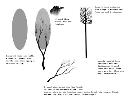
tree brushes


hey guys, thought I'd throw up the tree brushes I used. I'll also put on a small tutorial on how to use them. We can probably use these tree designs for the fun-pack

http://www.sendspace.com/file/my35gb

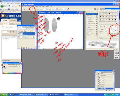
how to load the brushes.
Download the brushes and save them to a folder on your computer (maybe desktop for now, Iunno).
Open photoshop.
Go to the brushes dropdown menu . Click the little arrow on the right.
Another menu will appear - select 'load brushes'. Go to the tree brush set and select it. Fin !

Saturday, October 25, 2008


Hey Guys!


Here is my take on the main character and some extras. With all this talk of using the Samurai Jack style for layouts, I noticed that our character designs didn't match that look too much. So I looked up art work by Genndy Tartakovsky (creator of samurai jack, dexter's lab and powerpuff girls) and tried to make designs in that style. So here it is!

Comments greatly appreciated.


Wednesday, October 22, 2008

exploration


hey guys, i just wanted to share some of the exploration sketches i did today... i hope the inspire a few new ideas!


Tuesday, October 21, 2008

Hey team!

Ashley's post seems to be confusing a few people, so I thought I would clarify...

In the end, the consensus was that reading week is for RELAXATION, and there will be NO MANDATORY assignments for the group film over this week. I think maybe a few people were not aware of this, and I would hate to be the cause of undue stress.

That being said, if you WANT to work on the film, Ashley's list is a great place to start. It may be that the bgs might not work with the characters. There's also the issue of a somewhat bland main character, so ideas on how to spruce him up a bit are also welcome.

For those of you who have already done the work - I apologize for the confusion, and thank you for your dedication. YOU ARE ALL AMAZING PEEPS, K?!

Saturday, October 18, 2008

story

hey guys,
I just wanted to share this animation with you. A movie doesn't have to be complex to be good. Everything in this short film is so simply done, but it's so moving. I think it's the acting - the subtle details, that really help the audience connect.

http://www.youtube.com/watch?v=VsS4Tk-lrxo

Reading week ... becomes... Discovery week!!!

(((edit: Sorry guys, I didn't want to seem to come off as some kind of nazi. I didn't think this post would but i should have wrote that this was not all mandatory. I thought only commenting was. Everyone just kept telling me to post up the assignments so i did. I wanted this post to be as clear as possible and not something oddly confusing. But i guess i failed at that. I will now be more careful as to how i post from now on.)))

Sleepless Knights Mission!


1) 3 Layouts
Use the layouts (or make new ones) where the action scenes take place.
You can shrink layouts and then build the environments.
-One real
-One stylistic
-One pushed to the max... or whatever you feel is good


2) Everyone have their own take on the two main characters
-stylisitic? improved? cuter? pushed?
-you can sketch them or put them into your layout cause the style can greatly influence the character/layout.... or you can just let it stand out.

3)Thumbnails for storyboarding.
-This is to see what could work in the story
ie. Sister rambo scene, ultimate sibling showdown, sister training... stuff


Due: Must be posted by Wednesday.
You MUST comment on EVERY artwork. Good and considerate criticism is a very important.

In the words of Mark Komza: "It's fun!...so... Have fun with it!"
(((edit: Quoting teachers equals bad karma)))

Knights! I choose you!

Friday, October 17, 2008

feedback

hey guys, we've got some wonderful feedback here. I'm throwing up the ones I found had something to say. Take it all with a grain of salt.


- Make sure to have a clear distinction between the war world and the normal world so that the audience gets it
-Some really nice stuff. I love his fantasy sequences and the 'boss fight'. Maybe try to set up his dismissal of his sister really well, as everything hinges on that. Presentation was super energetic
- Nice simple story, potential for a lot of nice action. The story seems to need some work...seems empty. Interesting idea to distort layouts. Awesome personalities on Red Team. Main character could stand to be more thoroughly evolved. Motivations ? Arc ?
-Great concepts. Energetic. Great pitch. very entertaining. Work on the ending a bit more
- like the story, just make sure to play up the time where he gets shot in the back. Then at the last moment cut to his sister. Play up the tension at the end when he confronts the boss. \
- uniformly spastic. Makes the story kind of boring. I like the idea behind them but they're not all that nice to look at (regarding layouts). Design: I don't see how this is flat and graphic
- It's illogical that if the sister wasn't playing from the start she could come up at the end of the game and beat him. Weak logic.
-make the flag evident near the beginning. Good that he got what was coming to him and didn't just 'earn to help his sister'
- story isn't very capturing, nothing particularly draws you in. May be able to make it work if they can create enough drama during the 'fight' sequences. Color schemes seemed a bit acidic and all over the place.
-nice atmosphere in park layout. Graphic layout would be better without line. Agree with the limited palette comment. Interested to see how you keep the scenes from becoming congested with characters - re: last year's Monster Mash. Try to avoid. More difference in design between red team
-I hope you're good at animating water. Seems like a lot of build up for a weak punchline
-great story, will be cool to see in action, Sister design is great but brother design doesn't match. If all characters match the style of sister design, it would be a great looking film.
- strong message - good in and out of imagination. Good visuals to show when we go in the dream
-Nick is a bit 007. It's a solid story- surprisingly. I was concerned from what I heard, but I'm sure everyone feels that way. The design is a bit awkward. The explanation is a bit excessive. Need to clarify the difference between protagonist/antagonist. The boy is the protagonist and the red team is the antagonist. Emo kid is PRETTY FUNNY. The color work is really, really awkward. I can tell Fraeya's from everyone else's. Nice characterization but awkward design (re: character design). I would SERIOUSLY concentrate on color and professionalism. The pencil sketches that were poorly colored didn't make for a strong impression. The story is strong, however the rest of the aspects need to pick up.
\
\

to summarize guys, I think most people had a problem with our designs. Which is alright because that is what our fun-pack is for. Have a great week and rest up, we got some work ahead of us.

Tuesday, October 14, 2008

Man, I am rockin' the blog posts recently! So awesome. Anyway, here's the preliminary layout for how the pages will be set up in for the pitch package. I think it's lookin' pretty good, but then again, it is 3:30 am. Sleepless Knights indeed!


You will note that the text goes off the edge of the page. I know. I rasterized it before I noticed that. But this is only a mock-up! DON'T JUDGE MEEEEEE-

thanks to ti and rob for the beats. :B

Monday, October 13, 2008

WAGING WATERS A-GO-GO

idk, just thought i'd share this. plus a random title suggestion?

package content

Hey team!

Just a reminder that although the pitch is not until Wednesday, the material that we've each been assigned for the content needs to be FINISHED TONIGHT. Once it's done, please send it to myself (gregg.animation[at]hotmail.com). If you could get it to me before 11, that'd be best. 

If, for some reason, you can't be done until tomorrow (or at all!), please let me know ASAP. Arrangements can be made so that this will not be an issue. Because we want to have it printed tomorrow, the basic package needs to be done tonight, which is why the deadline is in place.

Thanks everyone for you commitment to the project!

-Jaimie

Saturday, October 11, 2008

fuuu-un !


just for fun I thought I'd render the sketch of the brother and sister. Here you go guys :)

Friday, October 10, 2008

disney reference

Howdy folks,

Just thought that I'd drop this link so that ya'll can see a whole ton of Disney concept art. There's a whole bunch of stuff there that can relate back to the style that we're aiming for, especially with the background pieces.

Art of Disney Animation

Thursday, October 9, 2008

Characters and Map


Hey guys, these are just the character pages Nick whipped up today. There's the designs for our two main characters that we are to use for the beat boards as well as all the drawings we did of the Red Team members. Oh, I also put up the map for any one interested in it.

have a good weekend

Rob

environment bgs


hey guys, some reference for layout. Different takes on stylization - do what you will since the layout look hasn't been exactly pegged down yet. PS - for those of you who want to see coal black, I threw a link on my blog.

Watergun References

Hey guys,
I decided that it was a good idea for someone to make a couple of pages for waterguns. I just needed some references today and i thought ... why not just make a collab of pics? I think Jaime had some already.


I'll probably print them out for everyone tmr but if not, here they are!